Resource Media — animated ads for clean energy campaign
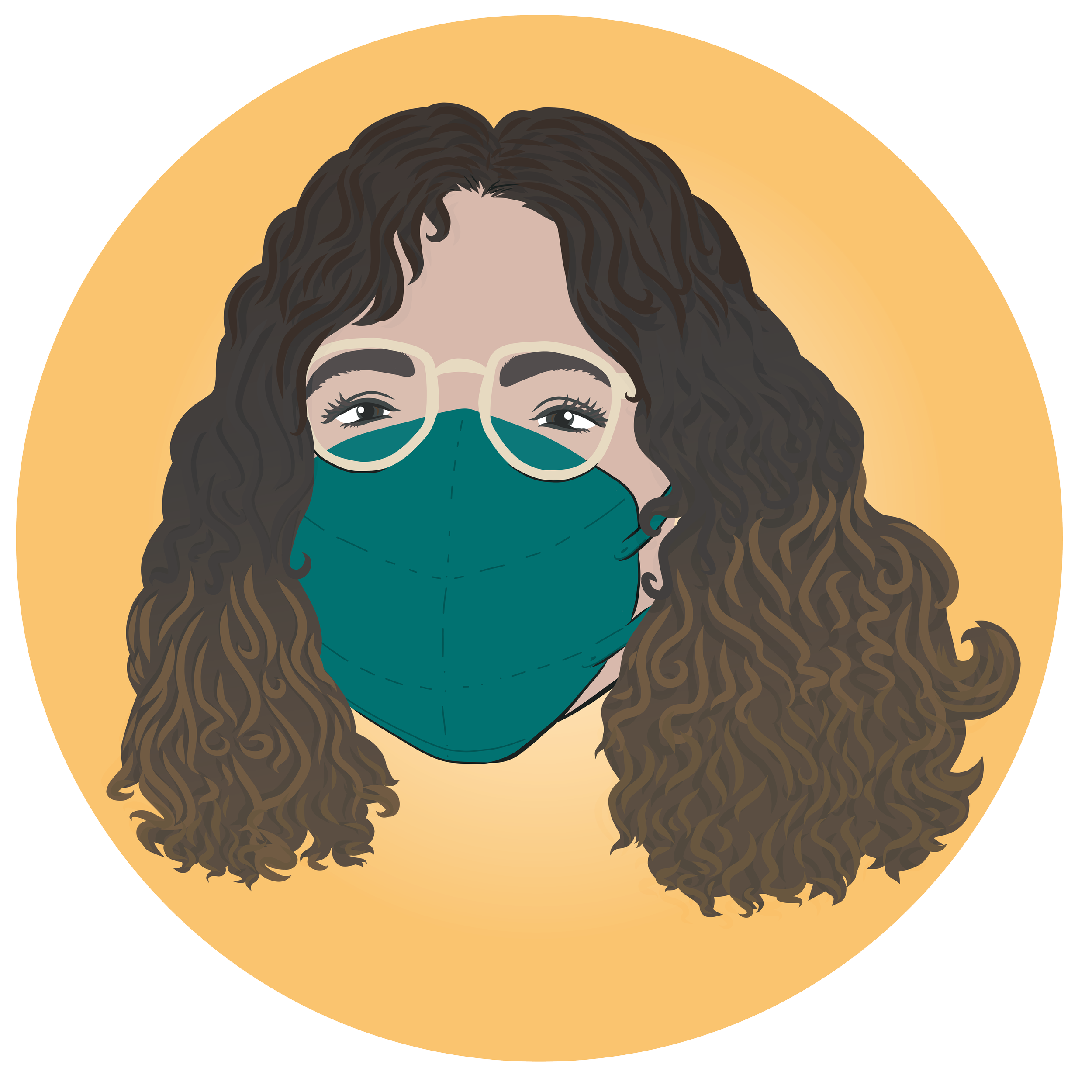
For this project, the client wanted visually engaging ads to highlight community leader voices on social media platforms.
It was a joy to bring these portraits to life with just enough animation to add interest and capture attention while not distracting from the text.
I used natural elements and landscapes from the areas of focus to emphasize the campaign’s feeling of being in harmony with the environment. Textures brought warmth and life to the designs’ overall looks, while font choices prioritized viewer accessibility.
Oregon Recovers — event materials design update, with standalone assets
This project was a reimagining of event materials I designed and developed for the 2023 summit program. I was excited to make the 2024 summit materials even more cohesive and vibrant!
I stuck with visual themes we introduced last year (spring flowers, hands hard at work), but in a bolder, more graphic style. Hand lettering the title and date added that extra layer of specialness!
Delivering standalone illustrations as digital assets (print quality and high res digital files) means the client truly owns the graphic package for their own use in slides, digital media, branded merch and more.
Recovery Network of Oregon — mobile app and site logo/branding, illustrations, style guide
Multiple skilled teams, ongoing community and provider input, and a client with passion and a plan that brought all of us to the table.
More than a rebrand, more than a project, the RNO website and mobile app project began as a vision.
An “all paths to recovery are valid” health model drove every facet of design and style — fonts, faces, colors pairs, everything was created with accessibility and approachability in mind, always with intention.
Knuckleheads is the awesome team behind the app and website’s design and creation. They put my original illustrations, team portraits, logos, and branding into action; fine-tuning the site and app’s layout and look was a deeply collaborative and creative process!
The talented team at Zo Agency designed and created a wide range of event and marketing materials using my creations and brand guidelines.
The RNO team tables at recovery walks and events across the state of Oregon using these materials! Mock ups in carousel by Zo Agency
RNO team bobblehead portraits — for the app, website, and org-wide use
Empire State Voices — political cartoon, in print
A (funny) political cartoon commission featuring public figures you may know, in my drawing style. Full cartoon (four panels) were published in print on Sunday, November 5, 2023 in The Daily Freeman (Kingston, NY) and Wednesday, November 8, 2023 in The Ithaca Times (Ithaca, NY).
Resource Media — environmental advocacy ad campaign, portraits and design
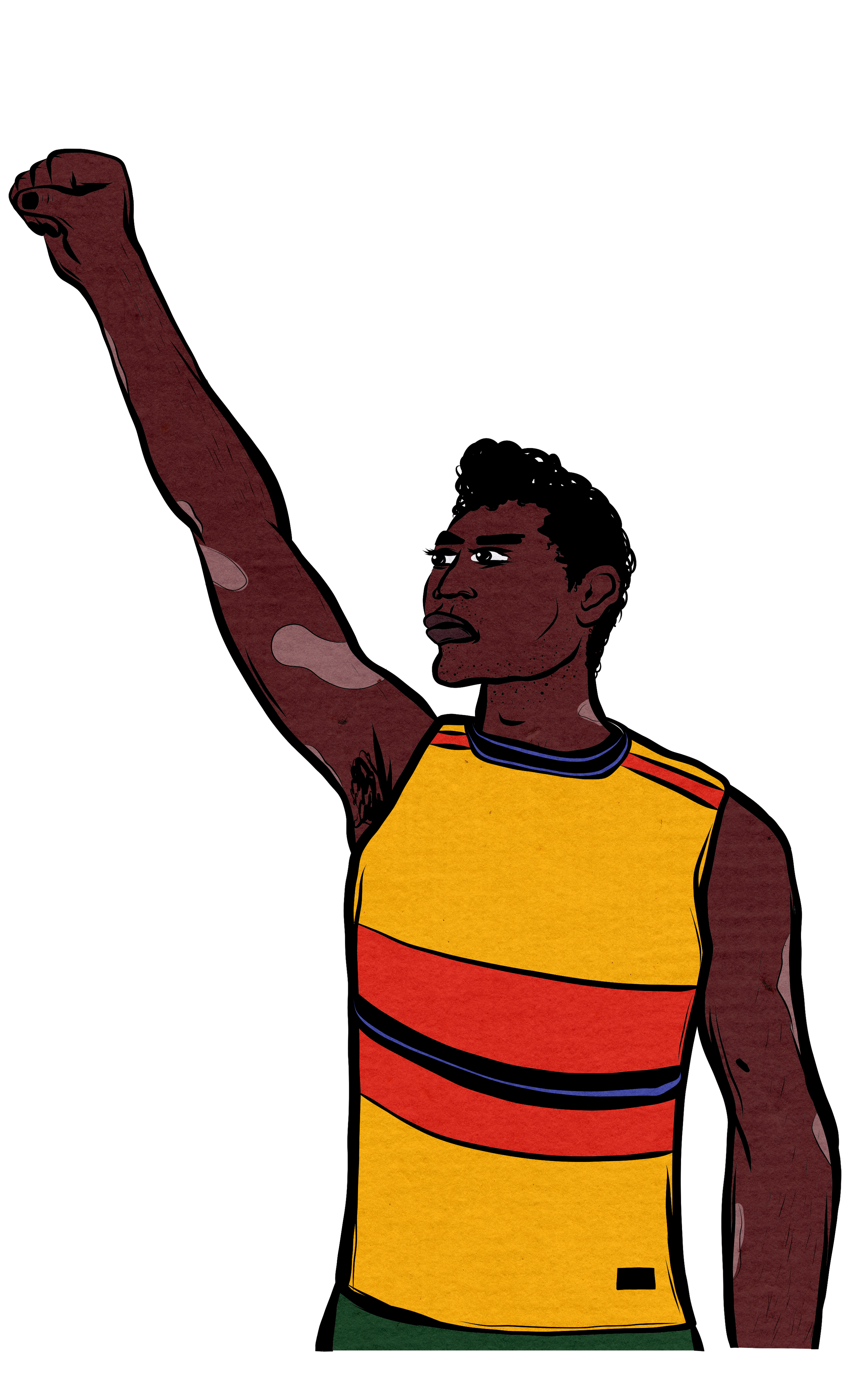
When I get to work with a client multiple times, we get a chance to have a deeper trust in the creative process. This client could trust me to find inspiration from campaign details, quotes and the overall subject matter to create a distinct style for the six 9” x 11” portraits.
We found a fitting font.
Each advocate had a key message to go alongside their portrait. The client and I found a font that kept the look on theme and readable.
The resulting “abstract coastal with a folksy feel” look is exactly what we wanted for our audience.
Sometimes, you don’t know what you want until you see it.
Nexus Community Partners / Hakeem Adewumi / Yates Creative — illustrations and branding
Working in a multi-team environment,
I developed and created original illustrations and branding for Nexus Community Partner’s Open Road Fund program. Hakeem Adewumi was creative director and produced digital assets using my illustrations. Yates Creative was overall project manager, bringing advertising, copy development, and a media plan to the table.
It was a true (and joyful!) collaborative effort, one where I would sketch and work on pieces while adjusting throughout. Across all digital, print and in-person promotion, there was a streamlined feel and look with unique campaign art to make it stand out.
Center for Story-Based Strategy — event graphic recording with comics
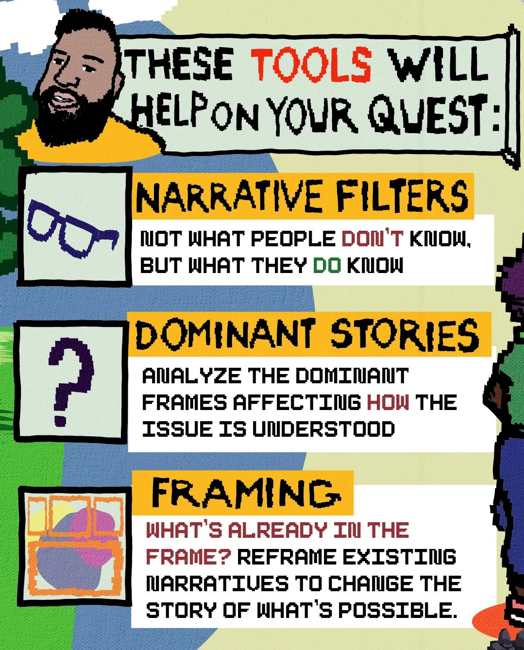
I created these panels using inspiration and direction from event presentation slides, client branding and team collaboration. These panels were shared with participants post-event as a refresher/shareable for their broader learning communities, as well as on CSS’ Instagram. Because these graphics are vector art, they are print-ready — meaning they can be reimagined into a booklet or zine anytime!
I came up with this sketch concept, based on the training (which I attended) and the presentation CSS offered to attendees. The client and I worked with this sketch idea to create the final panels!
The final graphic, all ten panels — shown here as a continuously scrolling Instagram post of ten panels total (maximum amount allowable on Instagram currently).
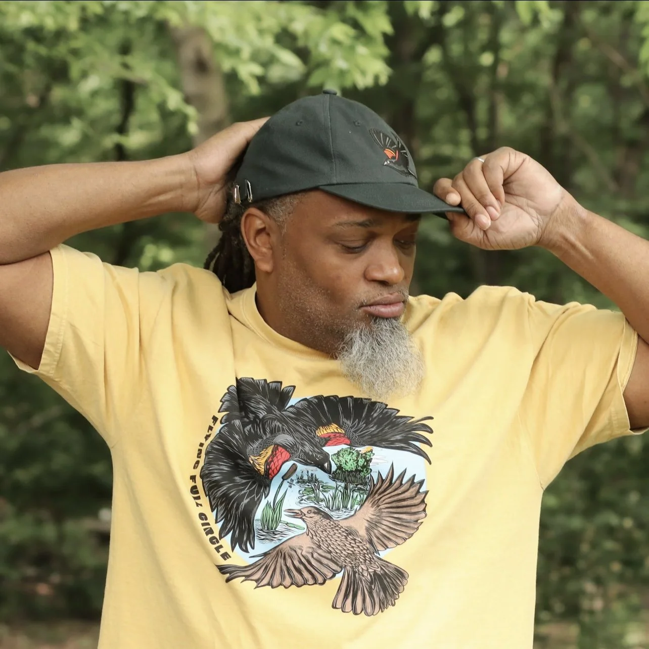
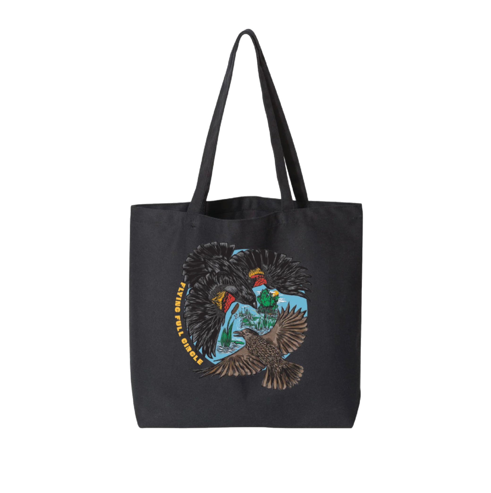
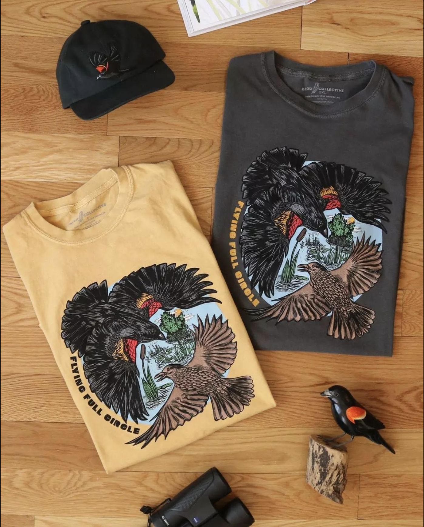
Bird Collective — Black Birders Week 2023 collection, original art for merchandise line
It was a great honor when the team at Bird Collective reached out to commission a piece for their annual Black Birders Week fundraising collection.
Featuring a male and female Red-winged Black Bird, the collection is in honor of and benefited the Black AF in STEM Collective, who leads and organizes #BlackBirdersWeek each year.
Final collection pieces (two shirts and a jumbo tote — hat design not mine) reflect collaboration: BBW Planning Committee’s theme and thoughts, the Bird Collective team’s expert touches, and my original art.
Read my artist profile on the Bird Collective website here.
All photos by Bird Collective
Resource Media — ad campaign illustrations
Delivered over a several month period, this client commissioned twelve original illustrations for a digital ad campaign.
Drawing inspiration from my own personal experiences, I developed and designed visual imagery concepts using research on audience, inspiration from areas local to the audience, and client input.
I adapted each design for Google Ad sizes and created all associated files in each size.
Next Up Oregon — stickers, digital assets, and postcard design and illustration
Next Up, a client working to build youth political power in Oregon, wanted a vibrant and compact design for donors and supporters to be inspired by and enjoy.
The full design was printed on 4x6” postcards and I adapted the design to a 3-inch oval sticker too. Below are individualized assets I also provided to the client for use in digital campaigns or future print projects!
3” Oval Stickers
I adapted the postcard design into matching stickers that were large enough for this detailed image and for any willing water bottle or laptop.
Portland Audubon Society — event materials, illustration for print and digital use
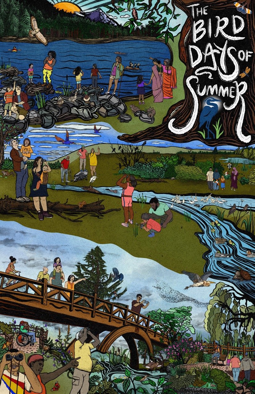
For this project, I wanted to vividly portray the Bird Days of Summer programming to the viewer and capture the imagination of prospective attendees seeing the materials. I created interlocking scenes depicting various locations where programming would take place — Trillium Lake, wetlands, and Crystal Springs Rhododendron Garden’s iconic bridge is featured on the inside spread.


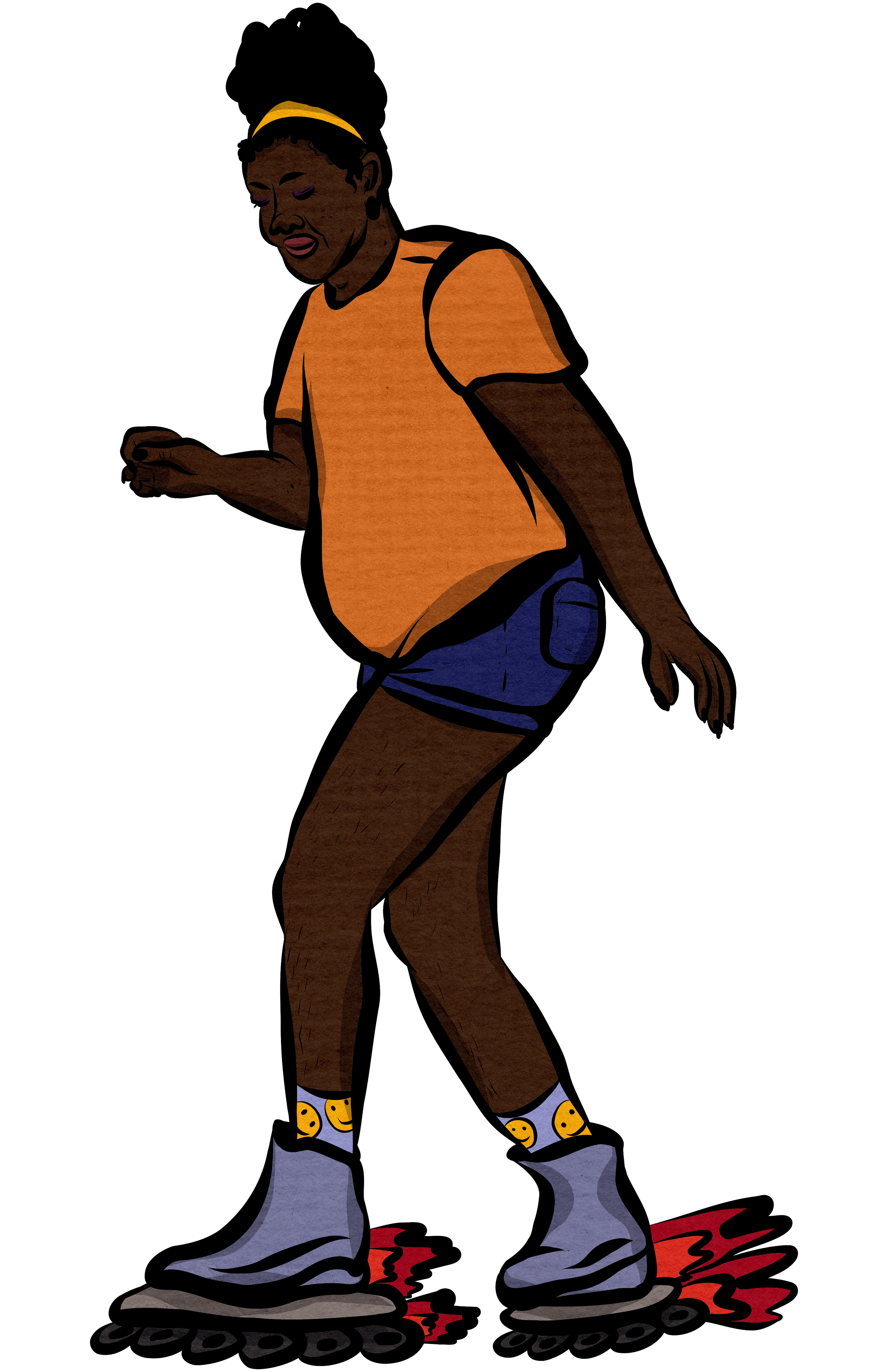
It was important to reflect the audience we wanted to attract: multi-generational families, Black and brown communities, and a diverse array of body types and physical abilities represented.
This art has been used to create a brochure, 11x17” poster, print magazine, website assets, and social media posts — both in 2021 and 2022.
Oregon Recovers — summit branding and program booklet design
This client wanted summit materials branded around their event name: Unity Within Community.
I drew inspiration from puddles, flowers and the organization’s logo colors since this annual event occurs amidst Portland, Oregon’s rainy, but blooming spring surroundings.
We wanted people-centered imagery that wouldn’t be people-specific. Hands offer blooms, echoing the summit’s sentiment: Everyone come and bring what kindness you can.
Standalone illustrations, such as the lettered conference title graphic and individual hand graphics, were delivered to the client for digital use. The program booklet was printed locally in Oregon.
Movement for Black Lives — quick turnaround graphics for social media carousel
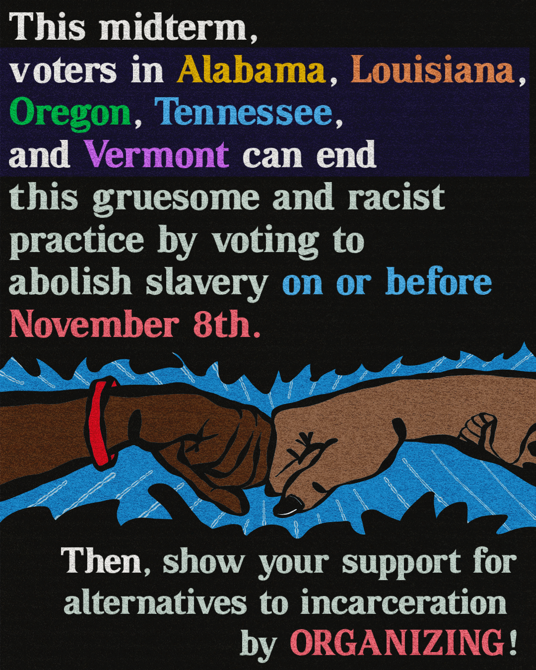
A request was made for rapid graphics support for a group through M4BL. In the space of several days, I was chosen for the project amongst others who reached out. From text on a document, I created these graphics and a themed package of digital collateral.
Final deliverables were five sets of carousels (organized into easily navigable folders) for each of the five states with slavery abolition on the ballot.
On staff at the ACLU of Oregon, I designed lots of print and digital media (and some merch).
In fall 2022, I illustrated the cover of ACLU OR’s 2022 magazine and designed/made additional illustrations inside.
Concurrently, I had the pleasure of lending direction to a set of talented artists and designing with their resulting beautiful work. In a collaborative team effort, digital and print magazines made it to almost 40,000 mailboxes.
I created a branded package of digital and print-ready materials to market an event to law-adjacent audiences.
With this in mind, the tone is more modern and muted — reinforcing the event’s serious subject matter.
Package included print-ready 11x17” + 8.5x11” posters and digital assets (sized for website/social media).
Planned Parenthood Advocates of Oregon — illustration for print and digital event promotion
A group of community groups mobilized quickly to create two pubic events aimed at bringing people together. In a quick turnaround, I relied on what I knew these organizations valued: diverse representation and design that helps people visualize the event’s feeling.
Both would be outdoors during the summertime – using bright colors helps communicate a family-friendly and joyful atmosphere!
ACLU of Oregon — designed and illustrated entire print + online publication
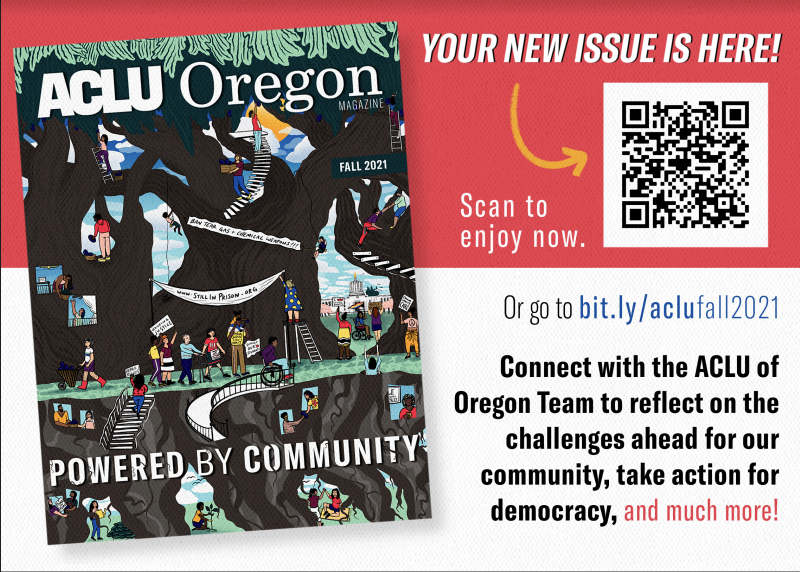
The ACLU of Oregon contracted with me to design, create, and illustrate their 2021 print and digital magazine. A whopper of a task for one person, I brought to life the tone shift the team wanted: fresh, community-focused, and a transition towards visual-heavy communications.
Flip through the digital publication below ↓
← Accompanying postcard design
20,000 print copies of the magazine were sent to doorsteps. The same amount of postcards, seen here, were sent to members who preferred a digital copy of the publication.
Spectrum Journal — editorial digital illustrations
Jumping into this fun project with both feet, I first read the article my work would be accompanying to find inspiration.
Knowing there would be plenty of references to adult toys and pleasureful experiences, visualizing both felt the right route. The fantastical landscape is fun and invites the reader to explore something new!
Intuition: a public health mobile app — one page infographic
Intuition wanted a data-heavy one-sheet aimed at investors and partners that also communicated the company’s youthful focus and innovative approach.
Using a mix of illustration, hand lettering, and graphic design, I created this visually engaging piece to bring their vision to life.
Event flyer | donated work for Ethical Tech Initiative’s Legal Tech Symposium Event
A cutting edge conversation needed a last-minute event flyer. With so much information needed on the page (and wanting to include speaker credentials) I went with modern and clear typefaces, minimal design elements, and prioritized centering the expert and incredible lineup of event guests.
Event flyer | donated work for Ethical Tech Initiative’s book drive
The flyer’s design tone needed to sit on the line of fun and serious, reflecting the event: an ice cream party for a serious cause. Illustrating just the ice cream (to grab viewers’ attention) and sticking to the GW Law’s color palette helped achieve balance.
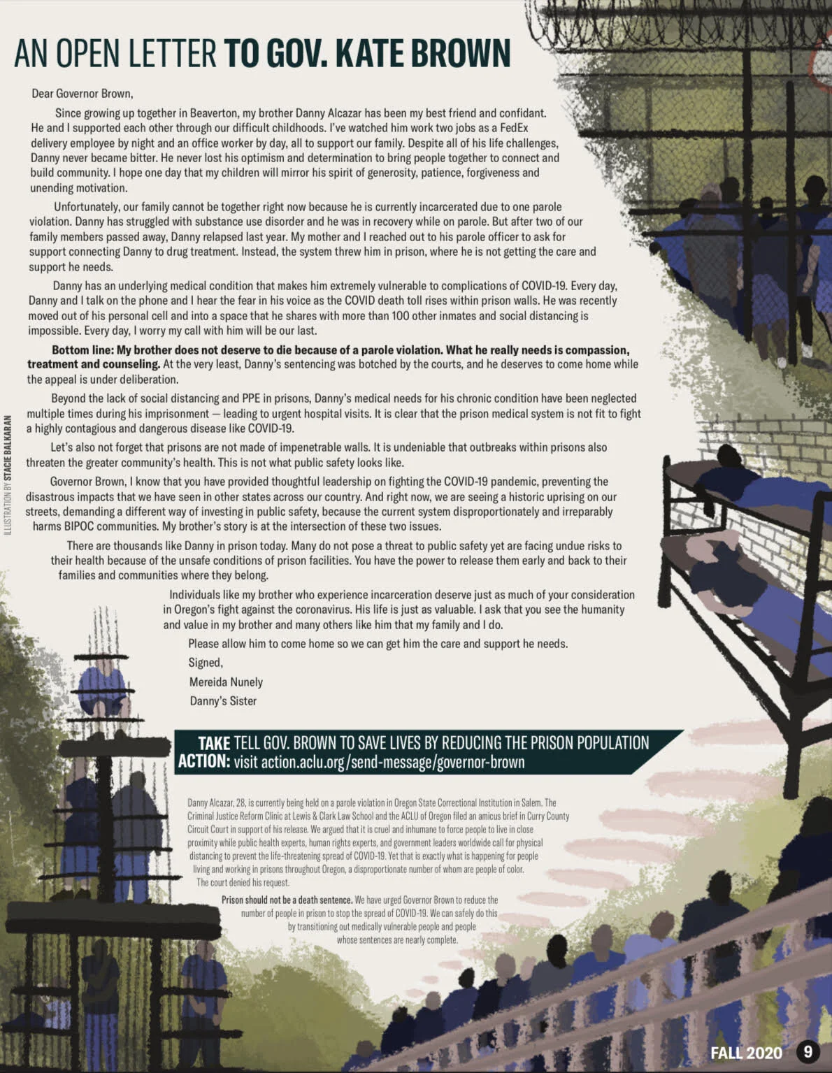
ACLU of Oregon — full page illustrations (print + online), 2020 Magazine
The ACLU of Oregon contracted with me to create two illustrations: one for a two-paged spread (left) and another full page illustration (right). I worked with brand colors and ACLU-owned photos for inspiration, adjusting for text layout as needed and creating versions with bleeds for the print edition.


